3 Film Noir Poster Anaylsis
China Town
 Theatrical poster by Jim Pearsall
Layout/Imagery/Artwork
This image has been created with two images, the protagonist is in a more darker and dominate shading. Which gives off connotations that the picture is a clear indiction on who is more important in the film, and its evident who the characters are; a protagonist and a femme fatal. As the smoke from the protagonists cigarette rises the expression on the femme fatale suggests that there is a more sinister and important part of the layout as it could suggests that she is trapped. However, Both there facial expressions suggest there is a powerful connection between them as it looks like they are looking at each other. However, the femme fatal seems to be looking down at the protagonist, in a way where she seems to have the upper hand over him; knowing his every move as well as having a higher layout in the poster which suggests this.
Fonts/ Colours
The actors in the movie are centered, in capitals, bold and underlined; which directs your attention straight to it. Also having a cream background behind the letters really makes it stand out due to the contrast between the light and dark. And , as this attracts the audience attention to the lettering it lets them know who is going to be acting a main role. Jack Nicholson is an American actor, film director, producer and writer and throughout his career, Nicholson has portrayed unique and challenging roles, many of which include dark portrays of neurotic and psychopathic characters. Nicholson is a twelve time oscar nominated actor which makes him the most nominated actor in the the history of academy awards. Which could lead to why the title on the theatrical poster is so small he as an actor alone in 1974 he draws in the audience. The colors in this poster are light and can suggest that this isn't a violent movie as it has no connotations of red. The femme fatal has no face out line the colour of her make up draw the audience in to her eyes and mouth which are shown through makeup this could give us an insight of what the movie will entail.
Representation Of Women - Femme Fatale
The Femme fatale in this poster is shown as a more superior women, especially compared to the protagonist who seems to have an equal amount of significants as she does. But her being a bigger image and being a higher up picture on the poster give us an inclination that she could have an important role in the film. Following sterotypical views on femme fatlas, and how they usually look; she follows the general representation. With her sly and deceiving looks, wearing that iconic red lipstick and eye liner.
Mildred Pierce

Layout/Imagery/Artwork
This image has been created with three images, the first image is the protagonist who is shown seduce by the fem fatal. This is shown in the poster by the protagonist kissing her neck. This could suggest that he is in love with her which causes a interacting atmosphere with the audience, making the audience feel there is more than meets the eye in this image causing there to be more than one connotation of what the protagonist can be described in this image. The other connotation the protagonist can be described in is manipulating the fem fatal causing her to be blinded by his touch causing her to fall into his clutches. The layout out shows that the fem fatal and the protagonist have more important's in the film as they are a bigger image on the poster, causing that image to show the audience they are the main characters and plots in the movie. In this post war noir mixed, typical soap-operish elements of the women's melodramatic picture, could suggest a typical murder mystery often told by flash backs as there is another image of the fem fatal below holding a gun. Witch shows a backbone of death sentences and important plots and twists in this theatrical poster. This could be targeted to the men as it portrays a dark and eluded side of how these two characters relationship plays out in the movie.
Fonts/Colours
The actors named are cantered in the middle on the right, in capitals, bold and underlined;
witch directs your attention straight to it. As well as the title of the movie going across the poster witch is cantered in the middle in capitals, bold and in colour. It is then complemented with a cream and light background behind the letters really making it stand out due to the contrast between the light and dark. This then attracts the audiences as it highlights who is going to be the main roles in the film witch can be a deadline fact on what type of audience is going to go to be willing to pay and watch this movie. It is then filled out with complementing colours witch all work well with each other making a interesting image for the views to see as well as how the movie could be played out.
Representation Of Women- Femme- Fatal
The Femme fatal in this poster is shown superior and weak, especially compared to the image below who is the same person however, from a different perspective witch allows us to see she has different personalities when with and surrounded with men. Witch is following the stereotypical views on femme fatals, and how they usually look; she follows the general representation. With her sly and deceiving looks, wearing that iconic red lipstick and eye liner.
Flamingo Road
 By Martinati
Layout/Imagery/Artwork
This image has been created by two images, witch is straight away eye catching to the audience the femme fatal in this image is shown shocked and against her will. She is trapped by this weapon pointed and fired at her, the connotations of this poster shows that she is weak and unable to respond without creating harm to her self and others. The other image is a gun witch is being shown as a dramatic and an important object in this poster and film as it can kill or harm another human being, this is being shown to the audience that this weapon has shocked her as we can see this with the expression on her face. This could be the protagonist holding the gun and firing it at her. These two images are shown in the centre of the poster with the femme fatals face expressed with fear and disbelief, as the gun is just emerged and has fired at her. The gun in this image shows a massive sign of significantly and how it is placed attracts the audience as it has shocked the femme fatal. The artwork is shown in a depth defining image that causes the colours and images to blend with each other causing the audience to be attracted to watch this film. This could be attracted to both men and women as there is an act of violence and act of suffering and pain witch could attract all types of audiences.
Fonts/Colours
The actors names are cantered in the middle top left corner, in capitals and bold witch directs the audiences attention straight to it. A well as the title of the movie going across the poster witch is centered in the middle in capitals, bold and in colour. It is then complemented with the flash of the gun fireing in the background making the font and lettering stand out. The contrast between the light and dark attracts the audience as us highlights who is going to be played in the film as well as who has directed it and produced it. This will then attract the audience you have targeted having the type of actor you have playing your main role as well the director and producer. This will allow you to know what type of audience you are going to be willing to pay and watch your movie.
Representation Of Women- Femme Fatal
The femme fatal in this poster is shown afraid and petrified with the weapon pointed at her face, this shows that she has been caught out and found out with something and has been trapped in the protagonists clutches. However, it is still following the stereotypical views on femme fatals, and how they usually look; she follows the general representation with her deceiving looks wearing that iconic red lipstick and eye liner.
Film Noir Poster draft
Draft Poster:
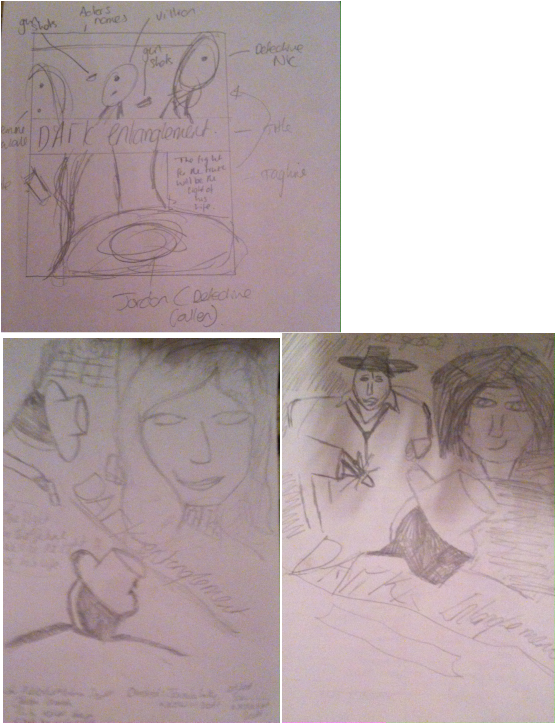
In this section i created a draft of what i could accomplish when creating my overall poster. These ideas helped me figure out what i could create in a finished product. As well as getting an idea for using photo shop as I had to create a poster that was suitable for my target audience. I think my ideas and drafts captivated me into making a different design as my original ideas where different towards the final product, i think this was for the better as the out come of my final poster allowed me to create a interesting poster.
In this section i created a draft of what i could accomplish when creating my overall poster. These ideas helped me figure out what i could create in a finished product. As well as getting an idea for using photo shop as I had to create a poster that was suitable for my target audience. I think my ideas and drafts captivated me into making a different design as my original ideas where different towards the final product, i think this was for the better as the out come of my final poster allowed me to create a interesting poster.
Original Images

Detective:
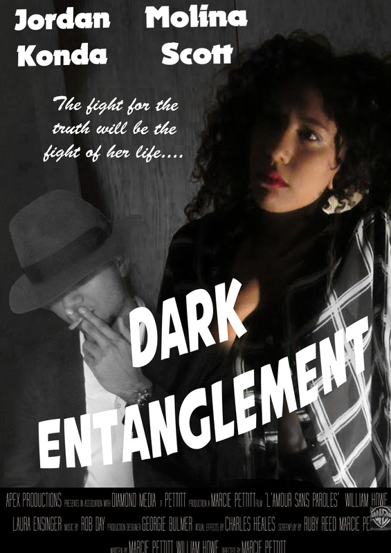
Was my model becuase he had the qualities of a good detective for example in this photo i used in my final poster because it was at a good angle and complimented my femme fatal. His pose gave emphasise to the audience as it was not over powering however, interesting in a sense of imagery. When editing this photo i used different tools on photoshop for example i used the magic wind tool to decrease the green screen out, i used the sponge tool to blend the images in together so that it flows together. I also used the tittle and headings to create a film noir font to make my film an overall look. Overall i changed the photo to complement my femme fatal in a harmonious way.
Femme- Fatal :
I used this model for my femme fatal because she's beautiful, amazing and sexy she's a woman who inspired me to push myself to the limit. From this picture she has a stereotypical sex appeal she is very feminine and looked fluent in the picture. She has the stereotypical look of a femme fatal, for example she has red lips long hair and looks untouchable. Which allows my target audience to want to watch this as she looks like a villain in the poster. Also she is the main image which allows me to adjust a more female dominate audience however, there is a detective which allows the audience to see there could be a relationship between them. Overall i used her to gain more of a contrast between the detective as i needed a female to change the imagery of the poster. She is an amzing person to work with and to be around im so happy i met this model.
Film Poster